Flickr Images

https://www.facebook.com/vignalistudio/ https://www.youtube.com/channel/UCL7SU_6-cxyuVEIHcV1nsiA

Muppet Studios: The Lost Legacy

with Imagineer Marcelo Vignali Explore the forgotten magic of Muppet Studios Land at Walt Disney World with the documentary, "Muppet Studios: The Lost Legacy." This compelling film delves into the abandoned dreams and whimsical visions that once brought the Muppets to life in a dedicated land. Featuring exclusive interviews with Marcelo Vignali, one of the visionary Imagineers responsible for designing the lost rides, attractions, and restaurants. This documentary offers a rare glimpse into the creative process that shaped this unrealized gem. Vignali shares captivating anecdotes about his time working on the Muppet Studios project, providing insights into the challenges, triumphs, and tragedies he faced with his team. Viewers are treated to never-before-seen artwork, unveiling the intricate details of the . Marcelo Vignali ends the documentary on a positive note, explaining how the spirit of Muppet Studios lives on in other Disney themed lands and attractions around the world. "Muppet Studios: The Lost Legacy" is a nostalgic journey through the unexplored corners of Disney history, reminding us of the vibrant Muppet dreams that once danced within Disney/MGM Studios. Marcelo Vignali's artistic career began with The Walt Disney Company at DIC Entertainment in 1987. Later, at Walt Disney Imagineering, he served as a Concept Designer leaving an indelible mark on projects such as Disney America, Tokyo Storybook Gardens, ToonTown, and Muppet Studios. - Beyond Disney, Marcelo has been involved in a wide range of projects in the realms of family entertainment, themed entertainment, and animation, boasting an illustrious career that spans across renowned studios and projects. - Marcelo's tenure at Sony Pictures Animation from January 2003 to April 2019 his creative fingerprints are evident in blockbuster films such as Vivo, Spider-Man Into the Spider-Verse, Smurfs - The Lost Village, Cloudy with a Chance of Meatballs, Surf’s Up, Open Season, and the Hotel Transylvania trilogy. Marcelo also spends a considerable amount of time mentoring young artists and encouraging the next generation. For more information about Marcelo Vignali's career and online galleries of his art, visit his website at:
https://vignalistudio.com Forrest Mallard (research/production/editing/voiceover) is a life-long nomad/adventurer. He's lived on 6 continents and has intimately explored a large portion of the Earth. Forrest also happens to be a life-long Disney fan. Having grown up in South Florida, his first life-goal was to work at Walt Disney World. Now, as a Custodian at WDW, Forrest uses his self-taught documentary and story-telling skills to share amazing, untold stories of the history of the Disney Company. He never dreamed that his little films would interest or include the involvement of iconic engineers, Imagineers, Disney Artists and Historians... but here we are. For more information about Forrest's travels and documentaries, visit his websites: https://tramposaurus.com and https://sizzlemap.com CONTACT : forrest.mallard@gmail.com SizzleMap.com is a documentary film blog and not affiliated with The Walt Disney Company in any way. To learn more about the Walt Disney Company, visit their official website at: https://thewaltdisneycompany.com


https://www.youtube.com/watch?v=IX5QgkJRZHQ

Muppet Studios: the Lost Legacy - w/ Imagineer Marcelo Vignali

 A question I received on this drawing was the size, this is a four foot long drawing. 


There are several other sneaky things I did to create image, one of which is a 3 point horizontal perspective drawing designed to put you into the space. It was virtual reality, before virtual reality.

It makes a difference because when you're looking at it in person it doesn't feel like forced perspective as it does in this small snapshot. This is because the drawing is big enough to fill your eye and the natural curve of the image projected into your eyes disguises the forced perspective. It's also large enough that to take in the entire drawing you are forced to move your head, and that motion makes you feel as though you're actually inside the space. 

(Prismacolor on Vellum, 1993)


Virtual Reality, before Virtual Reality

ToonTown was a really special project for me because I was able to participate at multiple levels all the way through the process. Typically, someone will be asked to come on board a project, and participate in one thing. It's part of the problem I have with the industry in that it is so compartmentalized. 

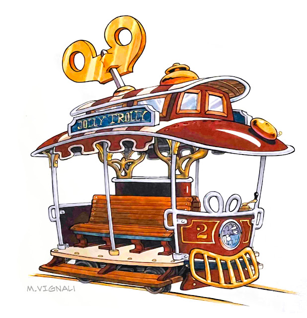
To give you a run down on my participation, I started as one of the four principle designers for ToonTown -- and the youngest member of the team -- that launched the project for Disneyland in Anaheim. I did designs for several buildings in the town, designed the ToonTown Trolley, was the lead designer for the Roger Rabbit Ride, did the show set drawings for many of the dimensional props...including the Benny the Cab that sits in front of the Roger Rabbit Ride and greets the guests as they come in, and ultimately illustrated the ToonTown silkscreen poster for Japan... where I combined all those elements in one painting.

This allowed me to work in architecture, animation design, character design, set design, show set design, and finally illustration. Painting the ToonTown poster for Japan was like a cherry on top to a wonderful experience. 

As an artist I find the entire creative process engaging, and fortunately ToonTown was one of those projects that allowed me to participate at multiple levels. 


#disneyland #toontown #rogerrabbit #rogerrabbitscartoonspin

The Reason Why ToonTown Was So Special For Me

I'm gonna roll the clock back to when I was the lead designer for Disneyland's Roger Rabbit Car-Toon Spin Ride in 1990/92. The goal was to end the ride with our guests going through a cartoon portable hole to escape, so I did this drawing of Roger Rabbit as we exited the ride. But how to make it work?

No alternative text description for this image
The Imagineering R&D department gave us two solutions. One solution was a wall behind a wall, and the illusion was an optical one. The bricks behind the first wall would be painted larger, so as we approached they would appear to be on the same plane. But that didn’t account for parallax, shadows, lighting, that would disrupt the illusion. It simply would not be believable.

The second solution was to have a wall with a hole cut into it, and a thin sheet of fog would be blasted in front to create a surface — and we would project a portable hole that appears as we exit the ride. But, that didn’t make any sense as you can project light, but can’t project the absence of light! That’s impossible. We had to choose between one of these two options!

So, my artist friend and Imagineering colleague Andrea Favilli reached out to magician Jim Steinmeyer — and it was Jim that helped us create the wonderful portable hole effect with a simple magic trick. Jim was an expert magician that built magic tricks for the biggest names in magic. He came up with a brilliant solution, and THAT is what we built in the ride. (I’m not going to divulge the secret here!)

I also designed this particular scene so that the figure of Roger was NOT entirely audio animatronic, but rather show-action animation. This meant it’s the extending arm that places the portable hole against the wall, not the Roger Rabbit figure. Again, another simple solution that helped to stretch our budget. This means the ride and this illusion can continue to work even if the equipment isn’t working. The posing of the character also works with or without animation.

Limiting the expenditures allowed us to spend more money on the rest of the sets so that the ride never felt neglected, stayed exciting... and prevented break-downs. More tech heavy rides have a tendency to shut down when their complicated equipment stops working. Not so with the Roger Rabbit Ride.

The Portable Hole at Disneyland

More LOST DISNEY ART. (Brush Pen Ink and Watercolor 1994)

I know... the title is a little "click-baity". Technically this work is not lost -- I'm sure the originals are buried somewhere in the vaults at Imagineering, but these drawings haven't been seen in nearly 30 years.

It was before the digital age, so hard copies of these drawings remained in my flat file tucked away inside a manilla folder mis-labelled "Tokyo roughs". I found them by chance while going through my files looking for theme park work for my website, www.vignalistudio.com

The Big Idea 

Legendary Imagineer Eddie Sotto had come up with an idea called Pirate's Island where we were going to revamp Tom Sawyer Island (TSI) at Disneyland and turn it into a pirate island. This was back in 1994, way before the Pirates of the Caribbean movies... so the idea was truly ahead of its time.

At the center, Eddie imagined there would be a large cavern where the pirates had brought their booty, and in there was built a bar where guests could dine. Eddie had asked me to come up with some ideas for things to put in the bar, I sketched out several things, and that's when I thought of these lovely ship's figureheads. I worked them out in color so we could add this to our pitch.

I even remember I had roughed out the entire bar and was planning to do one of those large drawings of the interior... unfortunately soon afterwards the project was scrapped. Eddie's Pirate's Island was a great idea that was short lived... but the big idea was so strong that when the Pirates of the Caribbean movie came out this idea resurfaced and TSI was turned into Pirate's Lair.

Working with Eddie was one of the highlights at Imagineering. His imagination and energy was infectious, and his ability to ideate with a pen really did teach me the importance of moving quickly to visualize the entire project.
Pirate Girl
Pirate Girl Ships Figurehead

Pirate Island's Ship's Figureheads


The Lost Disney Art -- Part 2

 Did you know that part of the Roger Rabbit Ride queue line and pre show at Disneyland was going to be outdoors?

Yep! It was the 1990s, and I was one of the four principal designers of Disneyland's Toontown, and the lead designer for the Roger Rabbit Ride.

(I found hard copies of these drawings in an envelope, inside my flat file while looking for images to put in my website, www.vignalistudio.com )

The assignment was tricky, I had to figure out how to entertain the people in line, without audio animatronics that move... because all that circuitry can't be exposed to the weather or temperature changes. Everything needed to be a static visual gag, so I created a series of drawings that worked as funny gags... but would entertain the guests by allowing them to use their imagination to piece together the happenings... like a detective. So, I designed this queue line to look like an old 1940s construction site.

We needed to create a queue line, but rather than just have a standard queue line I found a way to thematically use the water tower's pipes to get-crazy and create the various stanchions that separate the guests in order to weave them around. What if the stanchions themselves are part of the theme, and guests were in it? 

Eventually, the queue line was moved indoors, and we have the queue that exists today. So naturally none of these ideas were built, and I might add none of these drawings have seen the light in 30 years. Enjoy


The Lost Art of Disneyland's Toontown

In 1990 I was working at Walt Disney Imagineering as a show designer, and I had the unique opportunity to work on the Muppet Movie Ride with Jim Henson. When Jim passed away suddenly, the entire project Muppet Studios (AKA Muppet Movie Land) was shut down.

My office mate at the time, legendary Imagineer Eric Robison, really liked this drawing… so I gave it to him. All these many years later he kindly mailed it back to me.

I took the prismacolor drawing and placed it on my drawing desk. A 33 year round trip.

It’s prismacolor on velum, mounted on illustration board.


The Great Muppet Movie Ride... that never was

When working in animation, hands are some of the trickiest things to get right. In part because they have to look great, and they have to move. It doesn't matter if it's 2D, or CG animation, getting the hands right is imperative. So, I put a document together for the modeling department when we were working on a CG animation short for Garena's Free Fire Project, "Alvaro Awakened". 

Having worked as a figure drawing instructor comes in handy to understand the anatomy, but not the design. It's important to understand that designers are not anatomists, but rather need to create images that are pleasing to the eye, have a sense of design and rhythm -- and in the CG Animation world -- are functional.

Understanding the practical aesthetics, the functional aspects of anatomy, and the design/style consistency of the characters, are more important than the internal anatomical details. It may seem funny coming from someone that has studied and taught anatomy for decades, but that doesn't mean some of that knowledge isn't applicable. It simply means that knowledge isn't what the audience sees on the screen.
Getting caught up in the surface details in the wrinkles of the knuckles can be just as problematic as getting caught up in knuckle condyles of the bones. But, getting the shape of the stretching and bunching right, and rigging the movement, will go a long way.


Hands On!

I've just added another "Into the Design Lab", on one of my favorite illustrators, N.C. Wyeth.

Newell Convers Wyeth, also known as N. C. Wyeth — Born in 1882 –  died in 1945 at the age of 63. He was an American painter and one of the greatest American illustrators of the 20th Century. 


Throughout his career, N.C. Wyeth created more than 3,000 paintings and illustrated 112 books.

It was incredible to dive into his work and discover so many storytelling tips and visual tools. In one painting Wyeth is giving the audience three panels that tell a story. We read his illustration like a comic book... without ever realizing it.

Just $5 bucks on Gumroad; learning has never been so affordable.


Into the Design Lab: N.C. Wyeth


 I'll never forget the first time I saw Heinrich Kley's artwork, the exhilaration I felt was like life itself was being decoded before my eyes. I bought his books and poured over them; copying them in the hopes that in my blind attempt to imitate the work -- simply by osmosis -- I would begin to understand. Sadly, that was not the case, and Kley's work continued to remain a mystery to me.

So, I made copies of Heinrich Kley's artwork and pinned them over my desk. I kept these drawings as a reminder of what it meant to be in charge of one's own craft. For decades these drawing were like a lamp of light, illuminating my path. 

However, it was only decades later that I began to unravel the mysteries of Heinrich Kley's work. And now, I have the pleasure of sharing with you my knowledge and understanding of this beautiful artwork. So, join me @Gumroad: Into the Design Lab - Heinrich Kley

https://vignalistudio.gumroad.com/l/qszjmz

I give a short bio of Heinrich Kley, and then take an analytical look at the drawings of Heinrich Kley. And finally reveal the mystery behind these enigmatic drawings. We'll look at the gesture, balance, silhouette, overlap, structure, animation and echo.

The Art of Heinrich Kley

I've put together a series called Into the Design Lab, it's an artist retrospective, an analysis and a design dissection that reveals the compositional tricks and storytelling tips by successful artists.

In this five part series, I'm dissecting the works of the award winning comic book artist and science fiction illustrator, Frank Frazetta. Have you ever wondered how Frank Frazetta was able to create such compelling images? Why does his work looks different than everyone else's? I've gone ahead and broken down the lesson into five videos.

Part One: A quick biography for those that aren't familiar with his work. And an in depth look at the transition from ink to paint. How the directional strokes in Frazetta's comic book inking influenced his painterly illustration style... and his compositions. This is fundamental to understanding his work.

Part Two: I'll break down and analyze Frazetta’s use of layers, depth, color, framing, compositional elements. Even how his comic book experience in color taught him the importance of attention, and shocking the audience.

Part Three: We'll study Frazetta’s roughs. This was the blueprint for his illustrations, and how he stuck to the plan all the way through the final. This eye opening presentation will change the way you think about this often neglected stage of planning. You’ll see a direct translation from rough drawing to final and see how Frank’s conceptualization never changes.

Part Four: We’ll study Frazetta’s compositions by breaking them down into silhouettes, study their structural arrangement and design, the importance of overlap, value, and one of the most unique and powerful storytelling devices, Frazetta's use of animation as a means of storytelling.

Part Five: We complete this series with a final study on Frank Frazetta’s use of Dynamic Compositions, dynamic perspective and overlap. This is the signature aspect of Frazetta's work, he drags us into his compositions like no one else. We’ll also look at other complex staging devices using shape to tell a more powerful story. And, wrap it all up with retrospective look at the Frazetta legacy. 

Each lesson is priced at ONLY $5! I've priced this low so that everyone across the world would have access to this knowledge. I want to make a difference in your life, I want to make a difference in this world, and I want to make the world a more beautiful place with your art. Join me on @Gumroad: https://vignalistudio.gumroad.com/l/pvzmi

Next ITDL episode will be on the works of Heinrich Kley.

Into the Design Lab: Frank Frazetta 1 thru 5

Great artists throughout the ages have left their art lessons encoded in their works. In this series I deconstruct the artwork to find the compositional, story, and structural devices... as well as reverse engineer the thinking involved in creating their magnificent art.

 You don't know what you don't know, so it's hard to imagine what you're not aware of, so I've posted a free video lesson on Youtube to show you what you've been missing. It's a short 10 mins excerpt from one of the upcoming lessons, Into the Design Lab: featuring the work of Frank Frazetta

I want folks to know what they're getting in this series -- it will blow your mind. Into the Design Lab -- a Gumroad PREVIEW  It's an academic dissection of history's most indelible artwork. And it's free!


Into the Design Lab, with Marcelo Vignali -- FREE SAMPLE!

The power in each of these portraits speaks volumes to us. We wander around these images with our eyes, picking up on subtle hints in the anatomy, decoding each nuance of expression: a raised brow, parsed lips, or a glint in the eye, and we feel something visceral.
Great photographers not only capture their subjects, but also are making commentary how they feel about their subject. They see something within that person, and work the lights, the exposure, the depth of field, posing, to find that perfect picture...that definitive statement that can transcend decades and generations, and speak to us at our core. We see these portraits and feel something.
This is the power of the visual language.

One can't look at Kurt Cobain and think of his amazing energy, his voice, and his tragic ending. This portrait is interesting and very similar to Halle Barry's portrait. It's soft light that reveals his face, but unlike Halley the photographer added some light behind him to pop out the darker right side and silhouette the strands of his hair against it. The aperture also has a shallow depth of field, that means we're close up...close enough to feel like we know him. And, in this intimate space we start to explore the nuances that expose the raw nerve of his pain. His brow is slightly knit, his dirty hair hides part of his face as a wounded eye engages us. There is a soft highlight in one eye, he's alive and he wants us to know how he feels.
This enigmatic portrait shows a beautiful but vulnerable Marilyn Monroe; sad, unhappy, pained. There is no highlight in her blue eyes; they are lifeless. Her mouth slight agape, as though she were about to tell us what hurts...why it hurts. She's leaning forward as if to whisper this painful secret to us. Her turbulent hair echoes the machinations of her mind and the tumult of her life. Frozen in that moment, unable to tell us this secret. She's so close...but yet forever out of reach.
This is a wonderful portrait of Boy George...enigmatic. His face is like the moon, revealing only half to us, mysterious and occluded. It's a high contrast image, and the light is NOT soft but rather making a direct statement about the topography of his face. He's leaning forward to engage the viewer, his eye -- intense -- is locked in on us. He is not friendly, he's challenging us with his intense gaze.
This portrait of Halle Barry is wonderful. The soft lighting allows the light to carefully caress her face and reveal the subtle nuance and texture of her beauty. The tassels of her hair are softly arranged across her forehead. The horizon line is above her, she appears vulnerable, yet confident. The highlight in her eye indexes towards us, we feel as though the highlight is coming from our direction as we greet her. She invites us with the most subtle smile.
A young Marlon Brando, before his rise to superstar status. In this portrait it appears as thought Brandon is focused into that far away place of his future self. He can't see it, or even understand what he's looking for, but he aches to create it. The bright light on his face not only reveals the structure of his handsome face, but also lights the wall behind him...making it appear as though he's looking to engage this bright future that awaits him. The darkness behind him is mysterious, brooding...propelling him...and that also adds to the Brando mystique. But, the way this portrait is lit, and the position of his body, tells us Brando is apprehensive about stepping into the light. Also, the highlight in his eye makes it appear glassy...like there is some emotional vulnerability. The choice of this portrait is interesting in that he is not engaging us, rather he is absorbed in this tumultuous task of self discovery...as though he dreads the light.

Josh Brolin's Portrait speaks to us in aggressive confrontation. He isn't close to us enough for us to feel as though we know him, so we can't connect. His eyes squinting, his body squared up on us, shoulders rolled forward, there are negative spaces between his arms and his body ... he's ready to engage in the confrontation between himself and the viewer. He is not occluded into the background, rather he is clearly silhouetted against the background. He stands in defiance, and you know where he stands.
This is a very old John Huston, his portrait says a lot. The light is designed to accentuate every wrinkle, every freckle, every scar he has earned through out his 80 years. He is done playing any games, there's no vanity, no pretentiousness. He leans forward and engages us, as a friend. His hands folded under his chin, he has made himself comfortable and available to us...to listen to us. But, there is a foreboding element to this portrait, as there is no glint or highlight in his eyes. It seems to speak that his life experiences have exhausted him, and rather he is more interested in the world around him than in himself. This is an intimate portrait, John has made himself completely available to us.

The Visual Language of Portraiture